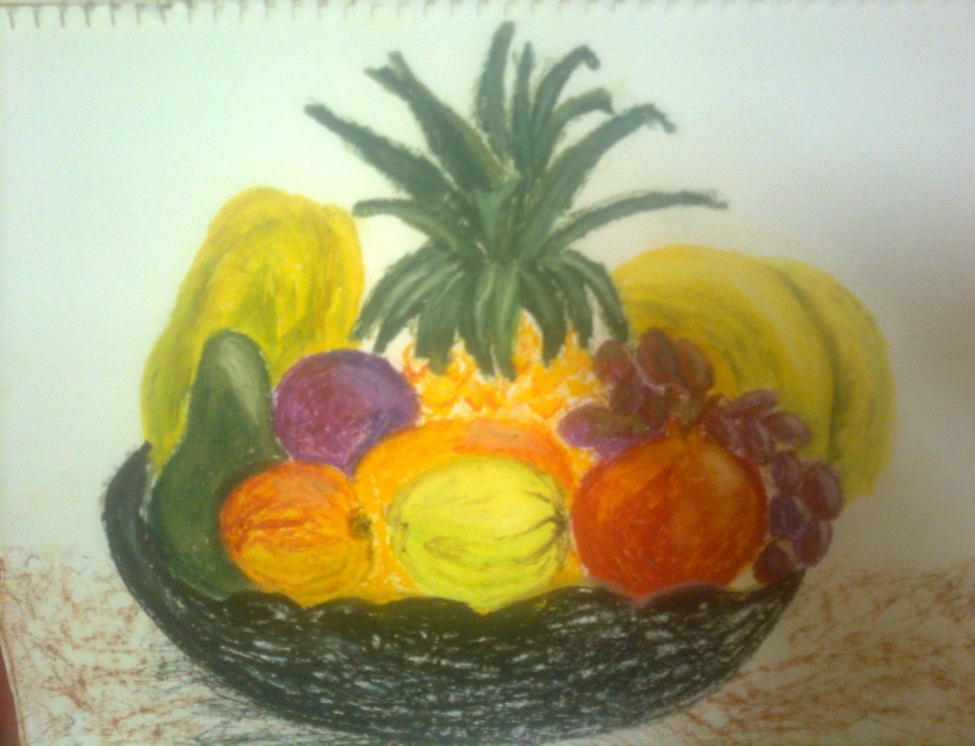
Saturday, June 4, 2011

Pencil crayon drawing of a soap composition


Radhia Firfirey,
Pencil crayon drawing of a soap composition,
2011.
42cm × 30cm, A3 size paper.
Crawford, Cape Town.
Price R30.
Pencil crayon is a type of media that you can use in drawing fine detail.  By using the thick pastel or charcoal media you will find that fine detail is very difficult to fill in. The pencil drawing of a soap composition is place together to show all the types of texture that you can represent in using a pencil crayon. In this soap parcel you find smooth textures like the packets, rappers and bottle. The basket & soap is coarse, the face cloth is soft and the scrub is a soft coarse net texture. To create the different textures you have to hold the pencil crayon at different angles. To give this piece of art work a three dimensional outlook you will need to use tonal value. Tonal value is created by form and placing tone on the surface will give the impression that the object has volume.
This pencil crayon drawing of a soap parcel is applicable to hang up in the bathroom or in the passage. The colour blue is a cold colour that will calm a person down if he or she does not feel well. The yellow and pink are warm colours. To form pink you will need to mix red and white. Yellow is a primary colour and pink is a tint colour. The cold colours and warm colours work in harmony with each other. The repetition of folds in the cloth shows depth in the basket that works in harmony with the item that is place in the fold. There is a strong emphasis on the colour blue with its detail. To add interest to my drawing I used the gestalt principle in it. The gestalt principle states that pieces of incomplete shapes can form a shape seen by the discerning eye. Try to see the shape in my drawing.            
 Firfirey, R. 2011. Pencil crayon drawing of a soap composition. Crawford, Cape Town. 

Painting of Kalima-E-Tayyib

Radhia Firfirey,
 Painting of Kalima-E-Tayyib,
 2010.
 60cm×44cm, A2 size paper.
 Crawford, Cape Town.
This paining is done in the Naskh Islamic style and it is placed in a landscape format. Naskh is another name for a Qurán script. Naskh was one of the first forms of scripts to be developed. This Naskh style is found in mosques all over the world today. There are many calligraphers that still practice this type of style. The text is the Kalima-E-Tayyib (Code of purity or declaration of faith) and it means “No one is worthy of worship, but Allah, and Muhammad (peace be upon him) is true and final Messenger of Allah”.
The language of this text is in  Arabic. Arabic is written from right to left. There are 18 distinct letter shapes, which vary slightly on whether they are connected to another letter before or after them. There are no “capital” letters. Islamic calligraphy is a visual expression of a highest art form for all the Muslims. This type of calligraphy literally means writing beautifully and ornamentally. Islamic calligraphy is the art of writing, and by extension, of bookmaking.    
I used blue paint as the background and place light green above the blue to bring the shapes forward. The yellow colour is the focal point of the beginning of the sentence. The letters are outlined in gold paint. The contrasting shapes work in harmony with the script and the different colours in the sentence.
Firfirey, R. 2011. Painting of a Kalima-E-Tayyib. Crawford, Cape Town. 

Painting of Bismilla-hir-Rahman-ir-Raheem


Radhia Firfirey,
Painting of Bismilla-hir-Rahman-ir-Raheem,
2010.
65cm×50cm, A1 size paper.
Crawford, Cape Town. 
The calligraphy style I used is the Naskh Islamic style. I placed the text within a geometric shape. Bismilla-hir-Rahman-ir-Raheem means: In the Name of Allah, The Most Gracious, The Most Merciful.  The aim of using the yellow colour is to bring the orange colour forward as a focal point. When looking at this painting a person gets a sense of the shape flying towards him. The aim of this painting is to bring the sentence towards the viewer’s eye. To begin this project you will need: 5 × tubes 75ml Acrylic colour paint, 3 × synthetic / bristle Artists brushes (2 flat, 1 round), 1×Artist painting palette, and 1× 200 gsm A2 Artist paper.
The Naskh style was one of the earliest Quránic scripts. It was designed during the 10th centaury by Ibn Muqlah. The Naskh style has a very comprehensive system of proportion and displays a very rhythmic line. There have been many copies of the Quran written in this style and it is easy to read it. The proportions of this style are usually written with short horizontal stems and with almost equal vertical depth above and below the medial line. The curves are full and deep, the uprights straight and vertical, and the words are generally well spaced.
This painting is placed landscape format with the sentence as the for-draft. In the middle-draft a shape is place into the painting to create harmony and balance. The focal point is the Ba at the beginning of the sentence with which the shape links in harmony. The colours that are use in the painting are mostly warm colours. The word Ba is painted in a secondary colour, i.e.  Orange, that is camouflage with yellow. The red background is a complementary colour of yellow and green is a secondary colour that is complementary to red. Complementary colours do not camouflage each other and hence the words are emphasized. In this painting there is a sense of three dimensional perspective forms.
Firfirey, R. 2011. Painting of Bismilla-hir-Rahman-ir-Raheem. Crawford, Cape Town. 

Charcoal boxes and pumpkin family composition


Radhia Firfirey,
Charcoal boxes and pumpkin family composition,
2011.
60cm×44cm, A2 size paper.
Crawford, Cape Town.
Price R60.
The Charcoal boxes and pumpkin family composition is drawn on an A2 sheet of paper which is placed in a portrait format. This drawing was drawn from original items that were place in this composition. The drawing was captured from a bird’s eye view and it was drawn in the evening.  The whole idea of this composition is to study the forms and proportions of each item.  We use tonal value to create the forms of each item by using three different charcoal colours for example black, brown and white.  Form is created by the source of light that falls on each item to bring focus to the viewer’s eye. The shadow is used to show volume in the item.  This drawing would be applicable for a grocery store, kitchen wall and in a restaurant where the guest are situated.
These vegetables produce the same type of orange flower and have the same form of leaf. They grow on the surface like a creeper. They are all part of the same vegetable family. The texture of these vegetables has a smooth surface but the squashes are more round than the butternut and pumpkin.  The negative space and positive space works in harmony with each other.  If you are interest in buy this charcoal boxes and pumpkin family drawing then please contact me and I will even advise you as to how best to frame it.      
 Firfirey, R. 2011. Charcoal boxes and pumpkin family composition. Crawford, Cape Town. 

Oil Pastel fruit composition

Radhia Firfirey,

Oil Pastel fruit composition,
2011.
42cm×30cm, A3 size paper.
Crawford, Cape Town.
Price R 30.


Oil Pastel fruit composition,
2011.
42cm×30cm, A3 size paper.
Crawford, Cape Town.
Price R50.
This oil pastel fruit composition is landscaped. The different coloured fruit are placed next to each other to create a dominance focalization on the fruit. The transition of the fruit using tonal value gives the fruit a 3D outlook. To create the original colour of the fruit and to create the tonal value you need to mixed different colours. This drawing is appropriate to hang in the kitchen or in a restaurant where the guest are situated. It provides an appetizing backdrop to the scene you want to create and it could be a central point of conversation. 
When doing a composition like these two one may think that in order to emphasize each fruit one must place them next to a fruit of a different colour, but this is not always the case as tonal value may be used to emphasize two fruits of the same colour placed next to each other as seen in the second fruit composition. I think the volume also plays a big role in the composition. The shadow of the fruit is formed by using different shades and this creates volume in the picture. In the first composition there is a less strong light source and therefore paler shadows than in the second composition with a stronger light source. The coloured tablecloth under the basket of the first composition reveals less shadow than white tablecloth used in the other composition. Lines are created by dots and the shape is creating by lines.
To create this oil pastel composition you will need an A3 cartage paper, a board to draw on, and two clips to hold the paper and oil pastels. If you’re wondering what a pastel is it is a type of wax crayon. You find different brands of pastel for example Pentel and Marlin. This drawing is drawn from a real life fruit composition. If you are interest in buy these oil pastel drawings please contact me and I will even advise you as to how best to frame it.       
 Firfirey, R. 2011. Oil Pastel fruit composition. Crawford, Cape Town.